Interactively Visualizing Fantasy Football Scoring
 (screenshot – scroll to the bottom of the page for the actual chart)
intro
Every year, I compete in a few fantasy football leagues with friends. I wanted to make a tool to visualize fantasy football scoring to help with drafting and navigating the waiver wire. In this post, I’ll show you how to make your own chart.
prereqs
This tutorial assumes that the reader has some prior knowledge of R and, more specifically, the dplyr library.
setup
A player’s fantasy scoring is just a time series – he scores x amount of points per week. This type of data intuitively lends itself to a line chart, so that’s what we’ll make. In order to format our data and make an interactive (and filterable) chart, we’ll be using the dplyr and plotly libraries, respectively.
You can install these libraries by running the following:
install.packages('dplyr')
install.packages('plotly')
Once we’ve got the packages installed, load them.
library(plotly)
library(dplyr)
data import
First, we need the data. We’ll be working with offensive stats from the 2019-20 NFL regular season, courtesy of Pro Football Reference. The only issue I’ve encountered with these stats is that two-point conversions aren’t always properly accounted for, but that shouldn’t affect us much.
We’ll import the dataset from my GitHub, and store them in a variable named nfl_stats.
nfl_stats_url <- 'https://raw.githubusercontent.com/asonty/pfr-scrapers/master/data/2019_all_offensive_data.csv'
nfl_stats <- readr::read_csv(nfl_stats_url)
data prep
This dataset has way more variables than we need:
colnames(nfl_stats) [1] "_player_id" "_player" "_pos" "_tm"
[5] "_opp" "_result" "_week" "_day"
[9] "passing_cmp" "passing_att" "passing_cmp%" "passing_yds"
[13] "passing_td" "passing_int" "passing_rate" "passing_sk"
[17] "passing_yds.1" "passing_y/a" "passing_ay/a" "rushing_att"
[21] "rushing_yds" "rushing_y/a" "rushing_td" "receiving_tgt"
[25] "receiving_rec" "receiving_yds" "receiving_y/r" "receiving_td"
[29] "receiving_ctch%" "receiving_y/tgt" "scoring_xpm" "scoring_xpa"
[33] "scoring_xp%" "scoring_fgm" "scoring_fga" "scoring_fg%"
[37] "scoring_2pm" "scoring_sfty" "scoring_td" "scoring_pts"
[41] "fumbles_fmb" "fumbles_fl" "fumbles_ff" "fumbles_fr"
[45] "fumbles_yds" "fumbles_td" So we’ll just extract the relevant columns (and rename them, those leading underscores can cause issues later).
fantasy_data <- nfl_stats %>%
     select(`_player`,`_pos`,
            `_tm`,`_opp`, `_week`,
            passing_att, passing_yds, passing_td, passing_int, passing_sk,
            rushing_att, rushing_yds, rushing_td,
            receiving_tgt, receiving_rec, receiving_yds, receiving_td,
            scoring_2pm, fumbles_fl)

colnames(fantasy_data) <- c('player', 'pos', 'team', 'opp', 'week',
                            colnames(fantasy_data)[6:19])

colnames(fantasy_data)
[1] "player" "pos" "team" "opp"
[5] "week" "passing_att" "passing_yds" "passing_td"
[9] "passing_int" "passing_sk" "rushing_att" "rushing_yds"
[13] "rushing_td" "receiving_tgt" "receiving_rec" "receiving_yds"
[17] "receiving_td" "scoring_2pm" "fumbles_fl" That’s better. Now that we’ve got a dataset of every player’s weekly stats, it’s time to compute their weekly fantasy output. I’ll be using the scoring conventions from my main league.
# change these values to match up with your league's scoring format
pass_yd_pt <- (1 / 25)
pass_td_pt <- 4.00
pass_in_pt <- -2.00
pass_sk_pt <- -0.50
rush_yd_pt <- (1 / 10)
rush_td_pt <- 6.00
ppr_rec_pt <- 1.00
recp_yd_pt <- (1 / 10)
recp_td_pt <- 6.00
two_cnv_pt <- 2.00
fumb_fl_pt <- -2.00

fantasy_data$pts <- (fantasy_data$passing_yds*pass_yd_pt + fantasy_data$passing_td*pass_td_pt +
                     fantasy_data$passing_int*pass_in_pt  + fantasy_data$passing_sk*pass_sk_pt +
                     fantasy_data$rushing_yds*rush_yd_pt + fantasy_data$rushing_td*rush_td_pt +
                     fantasy_data$receiving_rec*ppr_rec_pt + fantasy_data$receiving_yds*recp_yd_pt +
                     fantasy_data$receiving_td*recp_td_pt +
                     fantasy_data$scoring_2pm*two_cnv_pt + fantasy_data$fumbles_fl*fumb_fl_pt)
Our dataset currently includes some potential snags like players who scored 0 points in a game and players who only played 1 game in the 2019-20 season (looking at you, Antonio Brown
 ).
).
Both of these types of datapoints can cause issues with filtering in plotly, so we’ll remove them.
fantasy_data <- fantasy_data %>%
     select(player, pos, team, opp, week, pts) %>%
     filter(pts != 0)

fantasy_data <- fantasy_data %>%
     inner_join(fantasy_data %>%
                    group_by(player, pos, team) %>%
                    tally(),
                by = c('player', 'pos', 'team')) %>%
     filter(n > 1)
For the sake of brevity, we’ll only create a chart for WR scoring (but you should be able to make a chart for any position using this code).
# change this from 'WR' to whichever offensive position you're interested in
fantasy_data <- fantasy_data %>%
     filter(pos == 'WR')
We’ve got a lot of receivers in our data:
fantasy_data %>%
     distinct(player) %>%
     nrow()
[1] 188A line chart containing 188 lines would just look like a mess, but fortunately, plotly allows the creation of drop-down filters for data within plots. We’ll leverage this to make our chart filterable by NFL Team.
Now, since plotly doesn’t allow a chart’s legend to be filtered (and I’d rather not completely remove it), I want to order players in the legend by their team. To do this, we’ll add another variable.
fantasy_data$tm_player <- paste('[', fantasy_data$team, '] ', fantasy_data$player, sep='')plotting
We’ve finally got the data in the right format. Now, we can give it to plotly to produce our line chart.
plotly, we’ve got to tackle to the most arduous part of this process: formatting our chart so it presents our data in a useful manner.
To do this, we’ll create a theme, which I’m going to call fantasy_chart_theme (creative, I know). The theme code is somewhat long (it’s not complicated, just tedious) so I’m keeping it folded for now, but you can view it at your leisure. I’ve tried to break it up into digestible segments.click here to display the full chart theme code
# ---- margin ----
margin_format <- list(l = 50, r = 50, t = 50, b = 50, pad = 4)

# ---- title ----
title_text <- '2019-20 WR Points Per Game'
title_font <- list(size = 15,
                   color = '#111111')

# ---- axes ----
x_axis_title <- 'Week'
y_axis_title <- 'Points Per Game (PPG)'
axis_font <- list(size = 15,
                  color = '#333333')
tick_font <- list(size = 14,
                  color = '#333333')
x_axis_format <- list(title = x_axis_title,
                      titlefont = axis_font,
                      dtick = 1.0,
                      tick0 = 1.0,
                      tickmode = 'linear',
                      tickfont = tick_font)
y_axis_format <- list(title = y_axis_title,
                      titlefont = axis_font,
                      dtick = 5.0,
                      tick0 = 0.0,
                      tickmode = 'linear',
                      tickfont = tick_font)

# ---- legend ----
legend_font <- list(size = 12,
                    color = '#333333')
legend_format <- list(x = 1,
                      y = 1,
                      font = legend_font)

# ---- tooltip ----
hover_font <- list(size = 12,
                   color = '#444444')
hover_format <- list(align = 'left',
                     bgcolor = 'white',
                     bordercolor = 'transparent',
                     font = hover_font)

# ---- annotations ----
caption_font <- list(size = 12,
                     color = '#adadad')
caption_format <- list(x = 1,
                       y = 0,
                       text = 'Source: Pro Football Reference',
                       showarrow = FALSE,
                       xref = 'paper',
                       yref = 'paper',
                       xanchor = 'right',
                       yanchor = 'bottom',
                       xshift = 0,
                       yshift = 0,
                       font = caption_font)

# ---- format base chart ----
fantasy_chart_theme <- plot_ly() %>%
     layout(autosize = FALSE,
            title = title_text, font = title_font,
            xaxis = x_axis_format,
            yaxis = y_axis_format) %>%
     layout(margin = margin_format) %>%
     layout(legend = legend_format, showlegend = TRUE) %>%
     layout(annotations = caption_format)

# ** this is the important part **
# ---- drop-down team filter ----
# create list of teams for dropdown filter
team_list = vector(mode = 'list')
for(i in 1:32) {
  team_list <- append(team_list,
                      list(list(method = 'restyle',
                                args = list('transforms[0].value',
                                            unique(fantasy_data$team)[i]),
                                label = unique(fantasy_data$team[i])
                                )
                           )
                      )
}

# add filtering component to chart theme
fantasy_chart_theme <- fantasy_chart_theme %>%
  layout(updatemenus = list(list(type = 'dropdown',
                                 active = 0,
                                 buttons = team_list
                                 )
                            )
         )
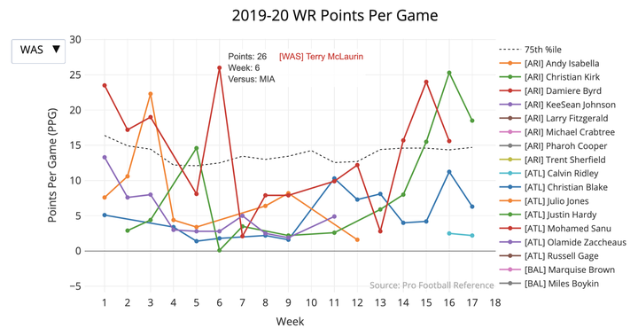
Lastly, this chart wouldn’t be very helpful without context. I’m of the opinion that consistency is king in fantasy football – I don’t want boom-or-bust players, I want guys that will consistently put up a respectable amount of points. To help distinguish these players visually, we’ll add a line representing the 75th percentile of WR scoring per week (i.e. in a given week, 75% of WRs scored below this mark and 25% scored above it).
Take note of the hovertemplate portions within the code (this is where we’re specifying the data that appears in the chart’s tooltips) as well as the transforms section (this is where we’re making our drop-down filter operational).
fantasy_chart <- fantasy_chart_theme %>%
  add_trace(data = fantasy_data %>%
               group_by(week) %>%
               summarise(q3 = quantile(pts, 0.75)),
            x = ~week,
            y = ~q3,
            type = 'scatter',
            mode = 'lines',
            name = '75th %ile',
            line = list(color = '#000000',
                        dash = 'dot',
                        width = 1),
            hoverlabel = hover_format,
            hovertemplate = ~paste('Points: %{y:0.2f}',
                                   'Week: %{x}',
                                   sep = '\n')
            ) %>%
  add_trace(data = fantasy_data %>%
              arrange(tm_player, week),
            x = ~week,
            y = ~pts,
            text = ~opp,
            name = ~tm_player,
            type = 'scatter',
            mode = 'lines+markers',
            hoverlabel = hover_format,
            hovertemplate = ~paste('Points: %{y}',
                                   'Week: %{x}',
                                   'Versus: %{text}',
                                   sep = '\n'),
            transforms = list(list(type = 'filter',
                                   target = ~team,
                                   operation = '=',
                                   value = unique(fantasy_data$team)[1])
                              )
            )
And there we have it, an interactive and filterable plot showing the weekly fantasy scoring of WRs from the 2019-20 NFL season.
(these charts are best viewed on a larger screen – they don’t always render well on mobile devices)
fantasy_chart
- Hover over points on the player curves to see more data about their scores.
- Double-click a player’s name in the legend to isolate their curve.
- Select areas on the grid to zoom in, double-click to reset.
wrap-up
We created a chart to view fantasy football scoring outputs. This is useful because it allows us to easily distinguish players with value, and quickly get a feel for how they are trending (for instance, if I had this tool last season, I probably would’ve grabbed Miami’s DeVante Parker quite early in the season).
If you found this chart beneficial, you can check out the rest of my fantasy football charts (which have more informative tooltips) at the top of my homepage in the fantasy football section.
The full code for this chart can be found here.